After creating low fidelity wireframes, I conducted 2 rounds of usability testing (5 participants each round) where participants were interviewed and asked to do a think-aloud exercise.
Overall, users thought that navigating the app felt intuitive. They commented that the straightforwardness of the app helped support the idea of being able to easily connect with other Asian immigrants about mental health topics.
Usability feedback was geared towards adding user protection solutions, refining the interface’s clarity, and improving flow between screens.
Findings - interaction cost & learnability
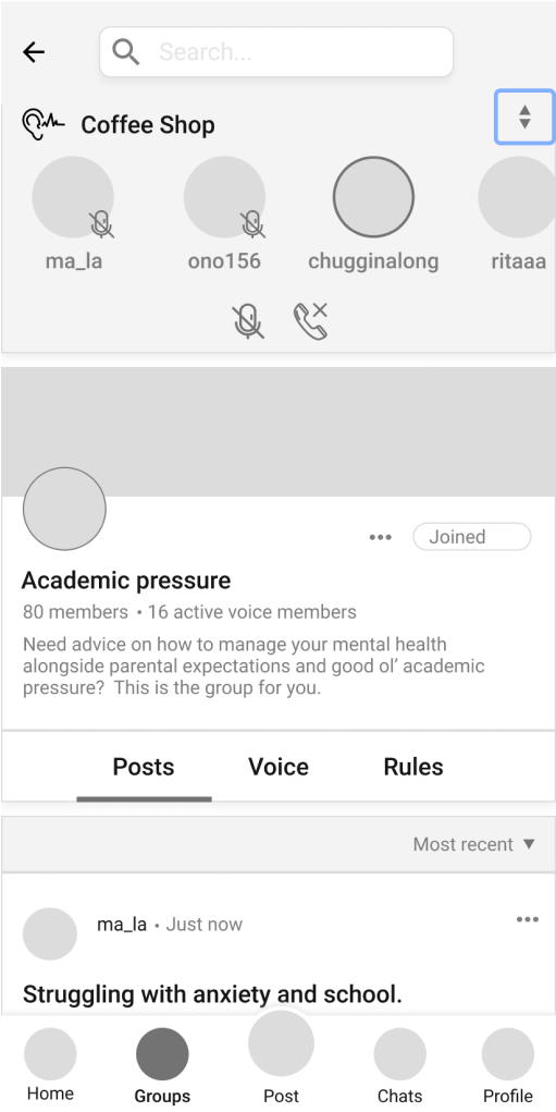
- Users expected that there would be a full screen view of active channel members after clicking join (instead of a minimized view as shown in Screen Flow Before 2)
- Users didn’t think that they were was much value in the most minimized view of the (Screen Flow Before 4) voice channel display; the default view was unintrusive as it was
- Users had trouble switching between the full screen/minimized views of the voice channel display (they kept pressing the up and down arrows instead of dragging)
Screen Flow Before - Joining Voice Channel
Solution
I changed the flow of joining voice channels and removed the most minimized voice channel view. Users now immediately see a full screen version of the joined voice channel after clicking join. This also increased the learnability of the drag interaction.
Screen Flow After - Joining Voice Channel
Findings + Solution - User protection
FINDING: Users found it concerning that there was no indication of how to report inappropriate behaviours in voice channels.
SOLUTION: I replaced the up and down buttons with ellipses (highlighted in blue below) to highlight the possibility of reporting users. This improvement was also made doable by the fixes I made for Findings - interaction cost + usability.
Before
After


