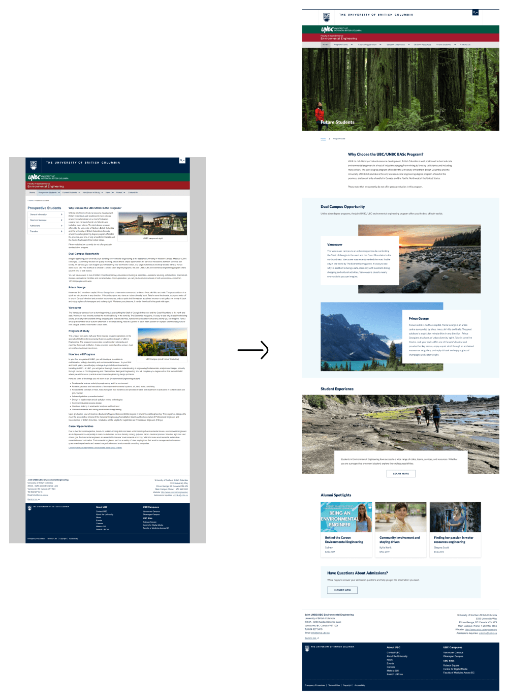
Knowing what we learned in the content audit and competitive analysis, the designs focus on improving the site's content layout and elements and navigation bar structuring.
Content layout and elements
I designed new APSC design system components previously not found on the site,
Snapshots at a glance banner
updated outdated elements to the existing design system,
and improved readability by shortening text width and content.
Navigation bar structuring
To restructure the nav bar, I first started off by seeing what pages could be combined together. For example, previously there were program requirements and degree requirements, but in restructuring we decided to combine these pages together for less redundancy.
Then I looked at the site's analytics information. I noted the pages that were getting very little views and then pushed for the removal of 7 pages, which the stakeholders agreed to.
48 pages -> 22 pages
Referencing the menus on other APSC pages, we also noted down what the commonly used menu headers were. The end result was a revamped top level menu structure that reduced its pages by half.
Final designs
The images below show some of the before and afters of ENVE pages that I redesigned.